Evidence over opinion
The interface wasn't ignored. It was understood through data before it was redesigned.
Case Study · Standard Bank · Enterprise Banking · MyMo Biz
Opening a business account should have taken minutes.
Instead, customers were navigating a journey of more than twenty screens, repeated compliance checks, multiple backend validations and several moments where uncertainty outweighed progress. Completion rates suffered, stakeholders assumed the interface needed another redesign, and every team had a different opinion about why customers were leaving.
The more we investigated, the clearer it became that this wasn't a UI problem alone. It was a product, service and systems problem hiding behind the interface.
This case study is about how research, journey analytics, stakeholder workshops and product design helped reshape an enterprise onboarding experience — reducing friction by redesigning the journey, not just the screens.
01 — The challenge
The ambition behind MyMo Biz was simple: give small business owners a way to open and activate a business account digitally, without spending hours in a branch.
The reality was very different.
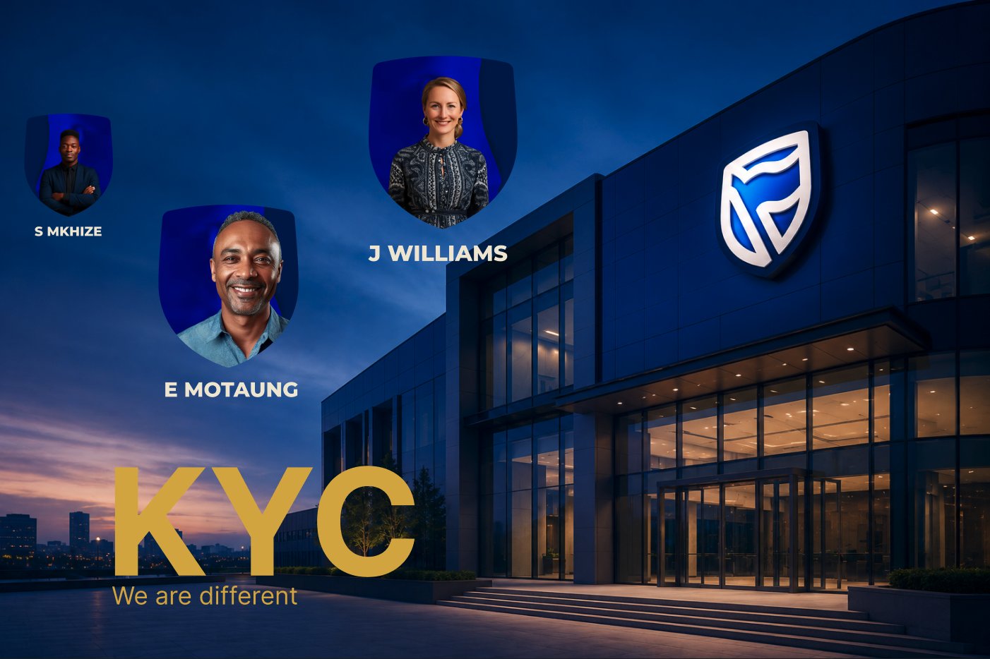
Over time, the onboarding journey had grown into more than twenty screens of identity verification, KYC requirements, compliance checks and product setup. Information was repeated, backend validations interrupted progress, and every additional step increased the chances that customers would leave before reaching the end.
This wasn't just a long form — it was an enterprise journey shaped by years of business rules, technical dependencies and regulatory requirements.
As completion rates declined, the obvious conclusion was that the interface had become too complicated. Simplify the screens, reduce the friction, and the problem would disappear.
The interface was part of the problem. Twenty-four screens asking for sensitive information is demanding for anyone.
But I wasn't convinced it was the whole story.
Before redesigning a single screen, I wanted to understand where customers were leaving, why they were leaving, and whether the experience itself — or the systems supporting it — were creating the friction.
That question changed the direction of the entire project.
02 — Understanding the system
Before redesigning anything, I needed to understand what customers were actually experiencing—not just what they were seeing.
The journey stretched across product, compliance, engineering, operations and core banking systems. Every screen represented decisions made somewhere else: identity verification, KYC requirements, backend validations, business rules and technical constraints.
Looking at the interface alone would only tell part of the story.
So we stepped back.
We analysed journey analytics to understand where customers were dropping off. We reviewed screen-level behaviour, investigated technical dependencies, spoke to stakeholders across the business and facilitated workshops to map the entire onboarding service from end to end.
As the picture became clearer, one thing stood out.
Customers weren't abandoning because of a single confusing screen. They were leaving because friction had accumulated across the entire experience. Long forms, repeated verification, unnecessary validations, unclear decision points and disconnected systems combined to create a journey that felt far longer than it needed to be.
Once we could see the whole system, the design decisions became much clearer.
03 — Following the evidence
The more we investigated, the clearer it became that this wasn't a problem we could solve by looking at a single screen or a single metric. Every piece of evidence told part of the story, but none of it told the whole story.
We started with the data—funnel analytics, step-by-step drop-off analysis, operational reporting and behavioural trends across the onboarding journey. The numbers showed us where customers were leaving, but they couldn't explain why.
That's where the conversations began. We spoke to business owners, listened to call-centre interactions, observed usability sessions, reviewed support cases and spent time with engineers, product teams and business stakeholders who understood the realities behind every validation, dependency and constraint. Branches, digital and customer support weren't separate channels—they were all part of the same customer experience.
Every workshop, customer conversation and research session uncovered another piece of the puzzle. Rather than validating assumptions, we challenged them. Every insight became an opportunity to ask a better question, and every question brought us closer to understanding where the experience was truly breaking down.
By the time we began redesigning the journey, the conversation had shifted. We were no longer debating how to improve individual screens—we had a shared understanding of the service we were trying to improve.
04 — What the evidence revealed
The more we analysed journey data, facilitated workshops and spoke to customers, the clearer it became that we weren't dealing with one isolated UX issue. We were uncovering a series of product decisions that, over time, had created unnecessary friction across the onboarding experience.
None of these problems could be solved by redesigning a screen alone.
One of the biggest opportunities wasn't visual — it was contextual.
Customers who already banked with Standard Bank entered the same onboarding journey as someone completely new to the bank. They were asked to provide information the organisation already held, and moved through the same verification process from the beginning.
For customers, it felt repetitive.
For the business, it created unnecessary friction, longer completion times and avoidable abandonment.
The opportunity wasn't simply to shorten forms — it was to design a journey that recognised who the customer was from the very beginning.
Journey analytics showed that customers weren't leaving because of one confusing screen.
Drop-offs were happening across multiple stages where backend validations, identity verification, compliance rules and technical dependencies interrupted progress. Every individual step seemed reasonable, but together they created an experience that felt slow, uncertain and difficult to complete.
The interface reflected those constraints — it wasn't the source of all of them.
Understanding that distinction shifted the conversation from redesigning screens to redesigning the service.
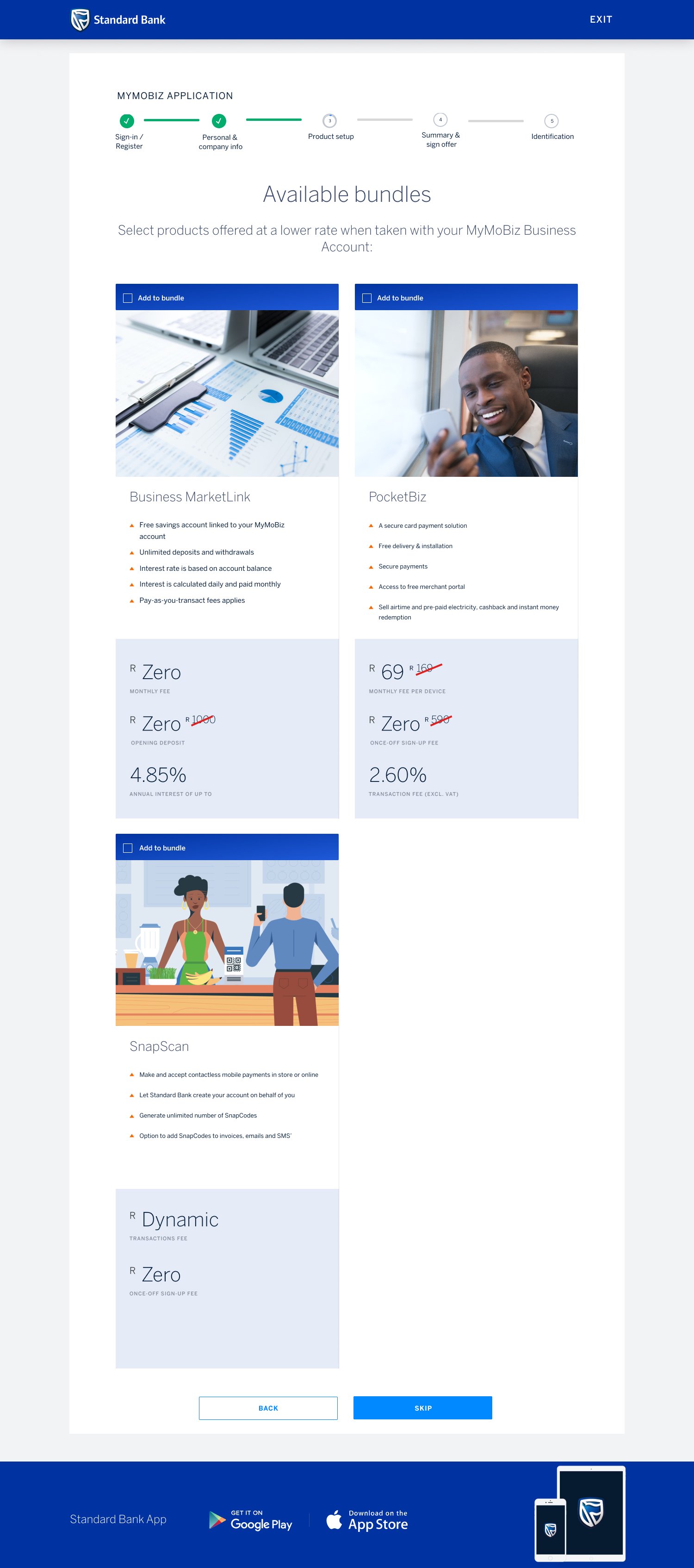
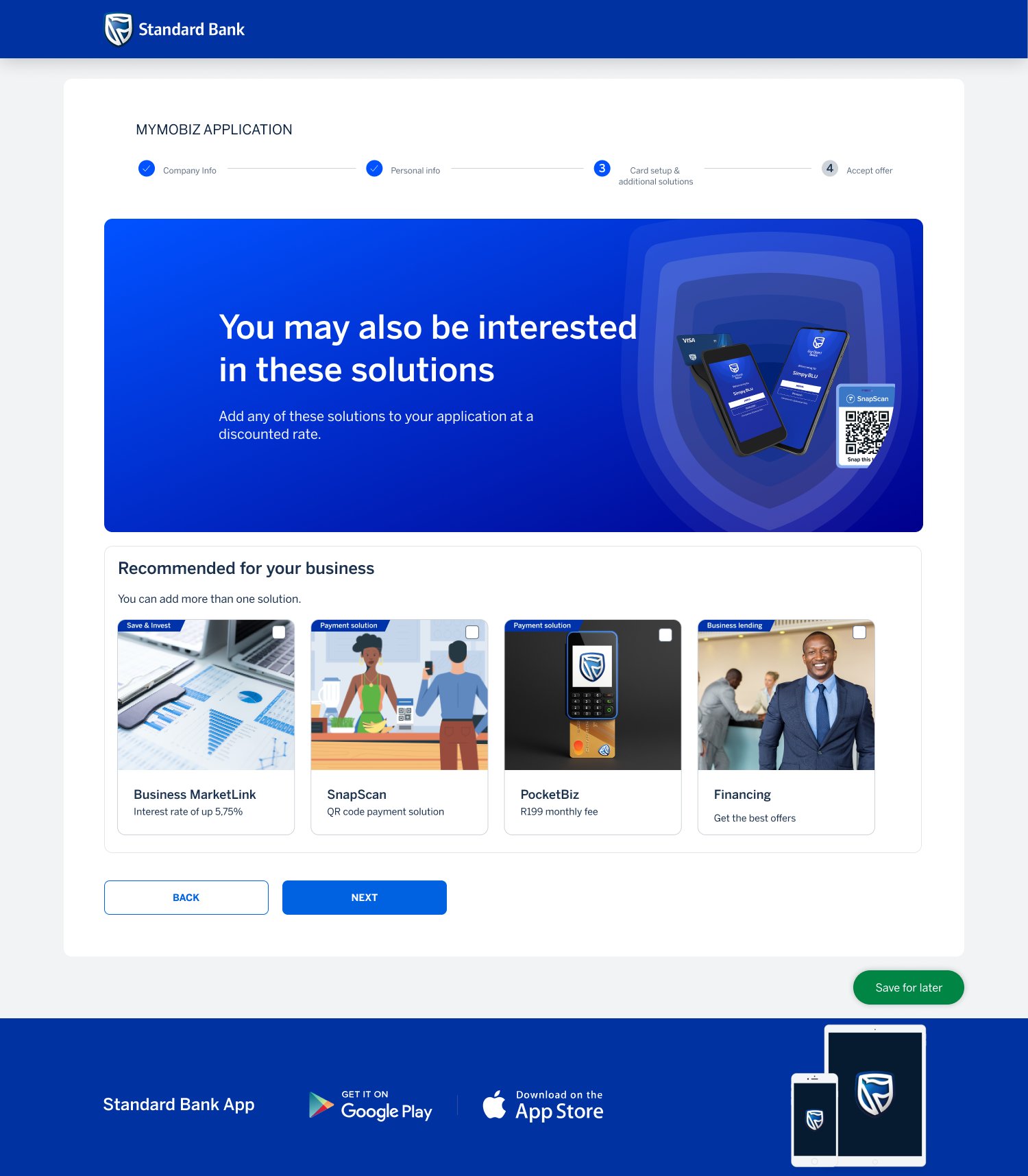
Cross-selling was another area where the data challenged our assumptions.
Customers weren't rejecting additional products like SnapScan, PocketBiz or Merchant Services because they lacked value. They were abandoning because those offers appeared before customers had successfully completed the task they came to do.
The insight was simple: people want to achieve their goal first. Only once trust has been established should you introduce opportunities to expand the relationship.
Changing when products appeared became just as important as changing how they were presented.
05 — Aligning the organisation
The discoveries gave us clarity, but they weren't enough on their own.
To change an enterprise journey, everyone responsible for it needed to see the same problem, understand the same evidence and agree on what the future should look like.
That became the purpose of a large cross-functional workshop.
We brought together Product, Engineering, Architecture, Compliance, Operations, Business, Research and Design to map the onboarding experience from beginning to end. Every dependency, validation, customer decision and system interaction was placed on the wall.
For the first time, every team could see the entire journey instead of only the piece they owned.
The conversation immediately shifted.
Instead of debating interface changes, we started asking bigger questions.
The outcome wasn't a collection of screens.
It was a shared blueprint for the future onboarding experience, prioritised around customer intent, technical feasibility and business value.
That alignment became the foundation for every design decision that followed.
06 — Designing the future service
By this point, the interface was no longer driving the work.
The research had exposed the real constraints. The workshop had aligned the organisation. The system had been mapped from end to end. Design became the process of translating those decisions into an experience people could actually move through.
Every screen had to justify its existence. Not because it looked cleaner, but because it solved a problem the evidence had already revealed.
The principles were simple.
The final experience looked simpler. But the simplicity wasn't visual.
It was the result of removing unnecessary work across the entire service.
07 — Validation
Every major decision was treated as a hypothesis.
Instead of waiting until the end to validate the work, research became part of delivery itself. We planned what needed to be proven, defined success before testing began, and used every round of research to shape the next iteration.
The goal wasn't to prove the design was right.
It was to discover where it was still wrong.
Working alongside Product, Research and Business, we built a structured validation programme that combined usability testing, journey analytics and customer interviews. Every finding fed directly back into the product before development continued.
Research wasn't a milestone.
It became part of how the product evolved.
Validation focused on five questions.
08 — What this project taught me
I'll always value outcomes, but I've learned that numbers rarely tell the full story on their own. What mattered most on this project wasn't simply reducing friction or redesigning a journey — it was changing how the organisation understood the problem. Once we stopped assuming the interface was the cause, we could finally focus on the product, the systems and the decisions shaping the customer experience.
The result was a product built with intention rather than assumption. Existing customers were recognised instead of treated like strangers. Validation became smarter instead of heavier. Cross-functional teams aligned around a shared blueprint instead of isolated requirements. The interface became simpler because the thinking behind it became clearer. Every design decision was grounded in evidence, validated with customers and shaped alongside the people responsible for delivering the service.
The interface wasn't ignored. It was understood through data before it was redesigned.
Recognising who the customer already is creates a better experience than asking them to start over.
The most important design decisions happened where journeys failed — not where everything worked.
The strongest products aren't designed by one team. They're built when Product, Engineering, Research, Compliance, Operations and Design move toward the same outcome.
09 — Reflection · What this project reinforced
Over the years I've learned that great products don't move forward because everyone stays in their lane. They move forward because people are willing to step into whatever the moment demands.
Sometimes that's leading discovery.
Sometimes it's facilitating executive workshops.
Sometimes it's sitting with engineers to understand technical constraints.
Sometimes it's analysing customer behaviour.
Sometimes it's refining the smallest interaction.
I enjoy all of it, because every part contributes to a better product.
I've always enjoyed working closely with engineering teams. Understanding technical constraints doesn't limit design — it expands what's possible.
Some of the best product decisions I've made came from conversations with engineers, architects and technical leads rather than from inside a design file.
Leading isn't about having the loudest voice in the room.
It's about creating clarity. Helping people align around evidence. Giving every discipline the confidence that they've been heard.
This project reinforced that the strongest products are built when people move toward a shared outcome instead of defending individual priorities.
One of the most rewarding parts of this project wasn't seeing the final interface. It was seeing every team recognise their contribution in the outcome.
Research informed the experience. Engineering shaped what was possible. Compliance protected trust. Business defined the opportunity. Design brought it all together into one journey customers could actually feel.
Whether I'm helping an enterprise transform a complex service, building an AI-native product from scratch or accelerating an MVP, the goal remains the same:
Understand the problem deeply.
Bring the right people together.
Build products that people genuinely enjoy using.
If you've made it this far, thank you.
This case study isn't just a showcase of a project. It's a reflection of five years spent asking difficult questions, challenging assumptions, learning from customers, collaborating with incredible people and growing as a product designer.
None of these lessons were bought. None of them were borrowed. They were earned through experience. Through long workshops. Through difficult conversations. Through failed ideas, better questions and the patience to keep searching until the problem became clear.
If there's one thing I hope this body of work leaves with you, it's this:
Complex products rarely have simple answers.
But behind every challenge is an opportunity to understand people a little better, align teams a little closer and build something that genuinely makes a difference.
Thank you for taking the time to read not just my work, but my thinking. It's been an honour to share it with you.
— Siyabonga Ngubane
Capabilities
Product Leadership
Product Delivery
Research & Validation
Technical Collaboration
Business Impact
Thank you